|
1.
Exposure And Light For Better Processing
Good, efficient processing in Photoshop needs the best image
possible from the start; you can’t just fix it in Photoshop.
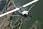
This photo was originally shot in harsh midday light, a light
that photography often makes look worse than it actually is.
Another challenge is exposure. The photographer underexposed
so he wouldn’t lose highlights in the wings. Underexpo-sure
causes distinct color problems in the dark areas, however.
The photo probably could have used about a half-stop of added
exposure, plus it would have helped to shoot in RAW. JPEG
is an excellent format, but it places some distinct limitations
on an image that has lots of bright highlights.
2.
Setting Blacks And Whites
The first step I always take with a photo is to check its
black and white areas (simply called the blacks and whites).
In this photo, I’ve adjusted the blacks and whites using
a Levels adjustment layer. Adjustment layers are easily accessed
at the bottom of the Layers palette by clicking on the adjustment
layer icon that’s a half-black/half-white circle. I made
the adjustments using the threshold screen that appears by
holding down Alt/Option while moving the left and right sliders.
What you see here is the white threshold screen (Alt/Option
right slider); it shows where highlights are clipping or losing
detail. You can see that the white is just barely starting
to clip, meaning there’s good detail in the white, but
not enough to wash it out. The left, black slider was used
similarly to deal with the darkest areas. A photo often gains
needed contrast from these adjustments alone.
3.
Overall Midtones
The colors required a lot of work in this photo, but with
the image’s heavy tonalities, you often need to open
up the tones so you can better see the color and detail you’re
working with. Midtones are best affected by Curves, though
you can do a credible job on many images with the midtone
slider in Levels. Curves simply gives you more control, as
demonstrated here.
I like to work Curves by first clicking somewhere in the bottom
or top of the curve (straight middle line to start), depending
on whether the control is needed more in the dark (bottom)
or bright (top) tones. In this case, I started with the bottom
point.
Click and move the curve up or down to make the midtones lighter
or darker, respectively. I moved the curve up, but it made
the lighter tones in the photo too bright, so I added two
control points to bring the line closer to the middle (reducing
the effect on brightening). You can add multiple control points
to the curve to make it move up or down. I often get by with
just three control points, making adjustments a lot simpler.
4.
Warming Up the Color
The tones now revealed some flat color in the photo. I wanted
to boost them and get some life back into the colors, but
lackluster colors caused by the light and exposure can’t
be fixed by just cranking up the Hue/Saturation. Overuse of
Hue/Saturation is one of the most common problems we see in
photographs entered in our contests.
I used a Color Balance adjustment layer over the plane. In
essence, I made a warming filter, adding yellow and red with
a little magenta. This kicked up the browns in the grassy
hills nicely, but it also made the plane look hazy. I wanted
to keep the good tonalities for both, so I decided to remove
the highlights in the adjustment with a little layer mask
help.
5.
Controlling The Effect
Controlling the effect on the hills and keeping it off the
highlights was a job for the layer mask. Layer masks turn
a layer’s effects on and off, depending on the tone:
black turns off the effect, white turns it on. Some people
like the phrase “Black conceals, white reveals.”
I used Color Range (Select > Color Range) to select multiple
points on the hills with the plus (+) eyedropper; you can
use the minus (–) eyedropper to deselect colors and tones.
I needed to keep the effect on the hills and turn it off elsewhere,
so I inverted this selection and filled it with black after
being sure I was in the layer mask (Edit > Fill > Use
> Black). I noticed the wheels picked up a little extra
color, so I painted black on them in the layer mask to turn
off the effect there.
6.
Name That layer
Once you get beyond a layer or two, it’s easy to forget
what you did in each one. I like to name the layers at this
point (or earlier if I remember), giving them short, descriptive
names that fit the adjustment. This is easy to do. Just double-click
the layer name to highlight it and type it in (older versions
of Photoshop require an extra step of right-clicking the layer
to get to Layer Properties, where you change the name—right-clicking,
by the way, is important for both Windows and Mac).
7. A
Color Boost
Next, I needed to bring out the magenta color on the plane.
A Hue/Saturation adjustment layer would do the job, but as
I said earlier, you need to use it cautiously. I thought the
colors in this photo could get odd if the magenta was adjusted
as much as I thought it needed,
so I did two things to limit how Hue/Saturation would be used.
First, I used Color Range again to select the specific color.
This picked up some of the warm tones in the hills, but mainly
selected the plane’s color. When an adjustment layer
is chosen at this point (in this case, Hue/Saturation), a
layer mask is automatically gener-ated based on this selection.
Next, I used the drop-down menu from Edit to select magenta,
which limits the adjustment to that color. Photoshop lets
you further refine the control with the eyedroppers. I used
the plus (+) eyedropper to click on the magenta color in several
places. Now, I could really increase the saturation of this
one color without screwing up the rest of the image.
8.
Shady Work
Next, the shaded side of the plane needed work. The color
isn’t very good because of the light and the exposure.
First, I needed to brighten that specific area, but nowhere
else. To do that, I added a Levels adjustment layer and clicked
OK without making any adjustment. Then, I went to the layer
mode at the top, clicked on the drop-down menu arrow and got
a long list of modes. You don’t need to know them all—Screen
and Multiply are both very useful, though: Screen to lighten,
Multiply to darken. So I chose Screen, which made the whole
photo light.
I needed to limit that lightness to the side of the plane,
so I filled the layer mask with black (Edit > Fill >
Use > Black; you can also use keystrokes that work with
the foreground and background colors—Alt/Option + Backspace
to fill with the foreground color, and Ctrl/Cmd + Backspace
to fill with the background color). Then I painted in white
over the side of the plane (in the layer mask, white turns
the effect on). Be sure to choose a soft-edged brush of an
appropriate size for the area—you can see the brush in
the screenshot shown here (the red circle). This is a much
faster way of dealing with a specific area than trying to
use a selection tool. You can quickly brush in the overall
area, then change the brush to black to fix the edges that
went too far.
9.
Richer Color
The shade on the side of the plane was now brighter, revealing
more color, including a gold stripe that wasn’t so visible
before. The dark magenta wasn’t very strong, however,
because it was so severely underexposed. When a dark color
is underexposed, it loses much of its chroma (chroma relates
to how much color is in a tone compared to gray, and as colors
drop in brightness, the tone loses that color, becoming grayer).
The only way to restore this color is to sample it elsewhere
in the photograph and add it to the area.
Using the Eyedropper tool on the toolbar, I clicked on a dark
magenta on the tail. Then, I enlarged the image to better
see the side of the plane. I added a new layer by clicking
the Add Layer icon on the bottom of the Layers palette (the
icon just left of the trash can). Next, I used a soft brush
to paint the color over the magenta on the side and front
of the plane. I changed brush size, as needed, to make it
fit, and erased places where I went too far. It should be
close, but doesn’t have to be perfect.
The color was right, but it looked like a blob. Another layer
mode came to the rescue: Color. This applies the layer to
the underlying layers, but only in terms of color. The tones
of the original side of the plane now came through. It was
a little strong, so I backed it off by turning down the opacity
of the layer. In addition, I found places where the color
went where it wasn’t supposed to, so I erased those places.
The photo had improved considerably since its beginning.
10.
Color Detail
I now noticed that the gold stripe was weak. I used the same
technique to add a new layer, sample a good gold, paint it
over the stripe, change the layer to Color mode and clean
up the painting. Actually, I discovered that I couldn’t
get a good gold from sampling the weak colors on the plane.
I sampled the best I could, then opened the Color Picker by
double-clicking the foreground color. I picked a better-looking
gold, painted it on, changed the mode, then toned it down
at the end by adjusting opacity.
11.
Balance
The plane looked good at this point, but I wasn’t satisfied
with the photo. I felt the hills in the background were too
bright—out of balance with the plane. I wanted to control
only them, so I went back to Color Range and selected the
hills. I used a new Curves adjustment layer to darken them
slightly (remember that the selected area comes in automatically
in the layer mask). You don’t have to apply a lot of
movement to the curve in Curves for this sort of adjustment.
I also painted out the effect by the plane’s wheel over
the ground because I thought it made the wheel disappear a
bit.
12.
Finish
I like to keep a master file that’s finished at its native
size, meaning sized and sharpened but still keeping the layers.
I sized this for reproduction in a magazine (Image > Image
Size—300 ppi, with Resample unchecked), then created
a new layer for sharpening. What I needed was a layer that
combined all of the adjusted layers into one and put it on
top of the layer stack in the Layers palette. Photoshop CS2
allows this to be done easily. Select the top layer, then
hold down all the modifiers plus E—Alt/Option + Ctrl/Cmd
+ Shift + E. This combines all the layers and puts the result
into a layer above your selected layer. In earlier versions
of Photoshop, you have to hold down these modifiers, then
hit N, followed by E.
This new layer allowed me to sharpen the photo without affecting
any underlying layer, which was a plus because I had to go
back and fix a problem I had missed earlier before using the
photo on the cover of Plane & Pilot. I used nik Multimedia
Sharpener Pro 2.0 to sharpen this layer. Sharpener Pro is
a very intuitive way of sharpening (it’s set to Halftone
in this example, but it can be set to specific printers as
needed), plus it has an advanced mode that helps solve noise
problems in a photograph.
13.
Before and After
Compare the “before” and “after” images
and you can see quite a difference. Notice that the adjustments
resulted in an image truer to how you would actually see the
plane, rather than a limited interpretation of the arbitrary
technology of the camera under difficult light and underexposure.
If you look at all the adjustments done to the image, the
process may seem a little intimidating. But if you take it
step by step and understand that each step, each layer, has
a specific purpose, you’ll figure it out. Try these ideas
on your photographs and see where they can take you!
• • •
Rob Sheppard’s latest
book, Adobe Camera Raw for Digital Photographers Only,
includes a chapter on using layers effectively.
|